Graphic Elements
Our momentum inspires our graphic elements. Structured and expressive, these visual components represent UF moving upward and on to the next discovery.
We’ve created a library of templates to make the design process faster. These layouts are good starting points, but each will require adjustments based on the piece’s unique content and specs.
You can find these templates on the downloads page.
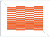
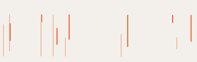
Momentum Lines
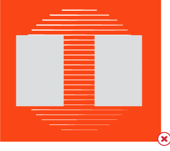
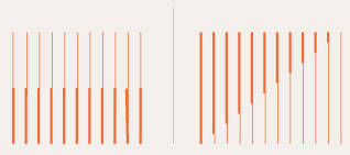
These vector lines help to anchor our type and images to the compositional grid and to create balance and unity among additional compositional elements.
Momentum lines direct the reader’s eye around the composition, so selecting the line option that works best for your layout is essential.
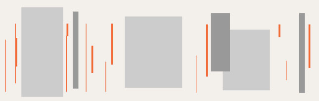
When using momentum lines with photos, consider simplicity and readability. Place lines behind the images to help draw the eye around the page. The momentum lines must never dominate the overall content of the photograph or the other elements in the composition.
Momentum lines are an easy way to add visual interest to simple layouts. Use lines as accent elements in negative spaces, and allow them to interact with typography to keep the reader’s eye moving across the page.
TIP: Use transparency and gradient feather setting to soften the edges of the momentum lines. This will help to make the lines feel endless.
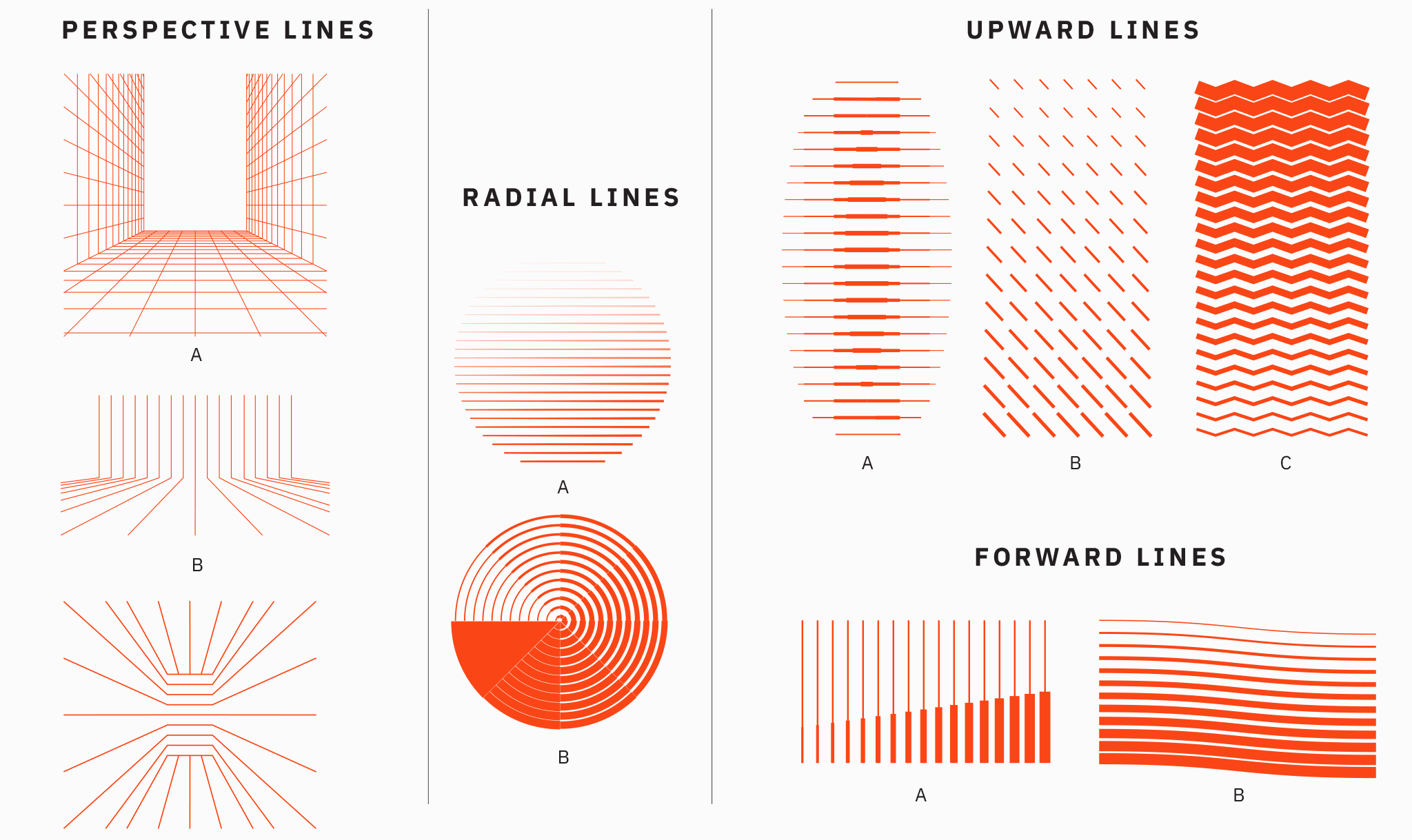
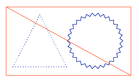
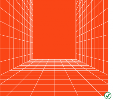
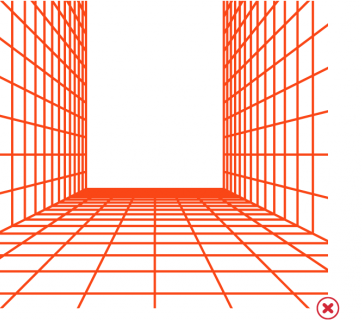
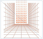
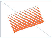
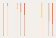
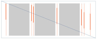
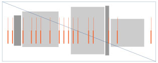
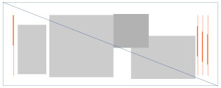
Perspective Lines
Perspective lines are great for grabbing a reader’s attention. The solid and directional angles draw the eye toward the center of the composition. Because of this, it’s essential to place any copy or photos at the center of these grid lines. Do not place lines on top of the photography.
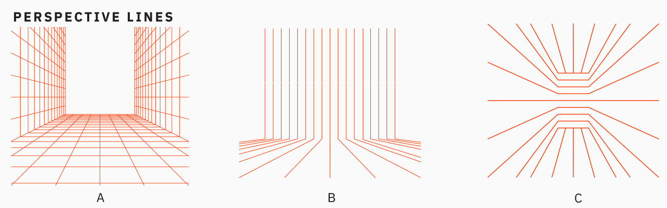
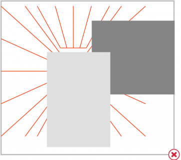
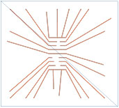
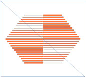
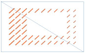
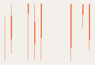
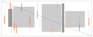
Radial Lines
Radial lines emphasize Florida’s ongoing impact around the world. These lines work best as a background texture behind short lines of copy or photography. Do not place lines on top of photography.
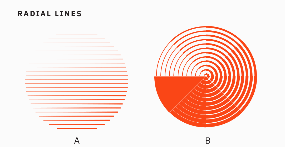
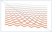
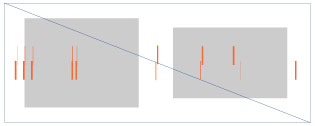
Upward and Forward Lines
Florida’s momentum is constantly rising. With this in mind, upward and forward lines infuse energy and drive into any piece. These patterns work best as background textures behind short lines of copy or photography. Do not place lines on top of photography.
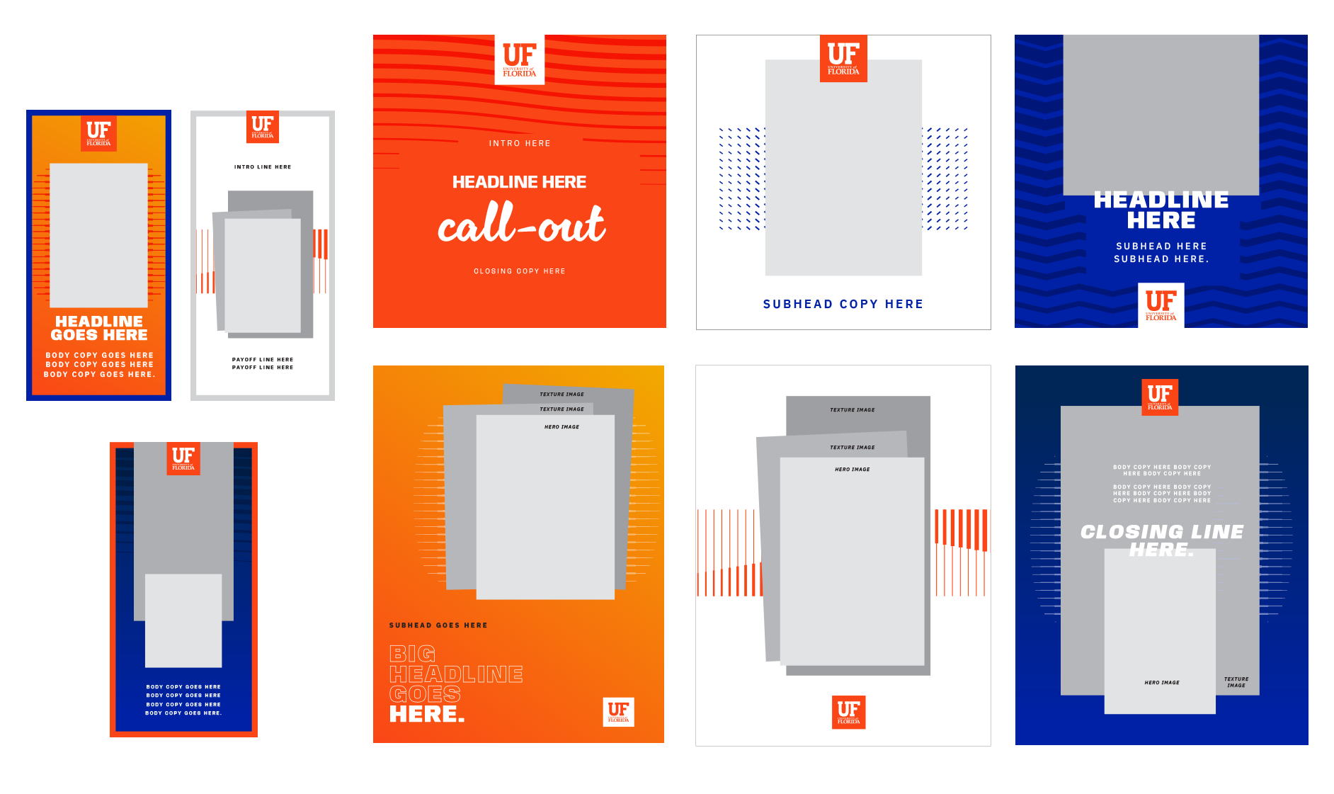
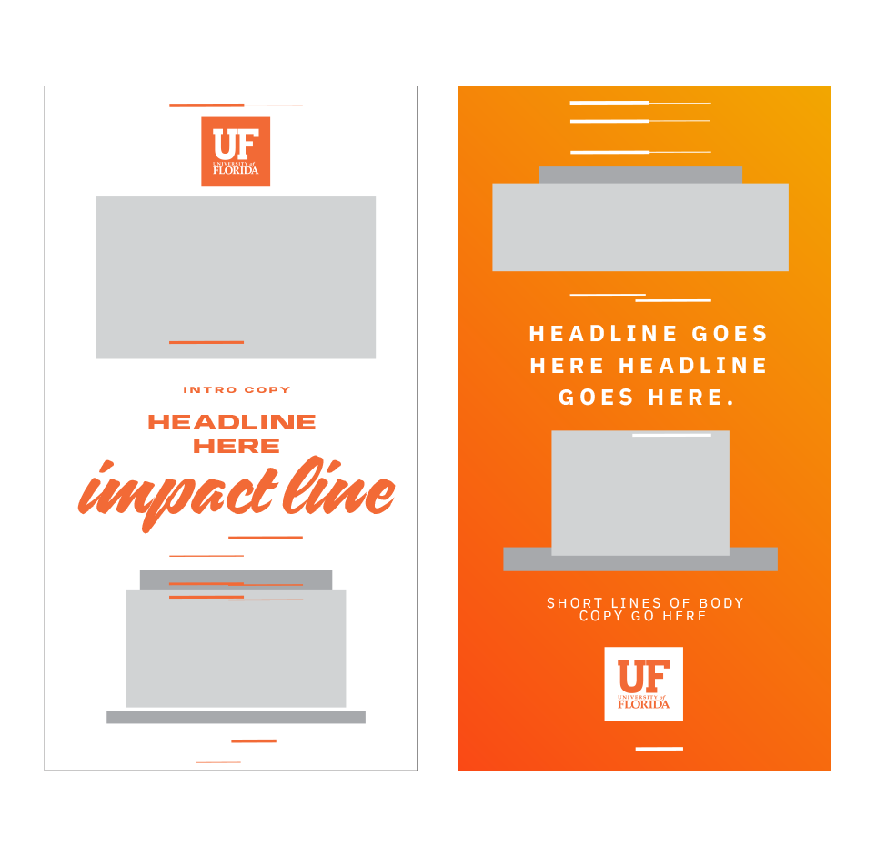
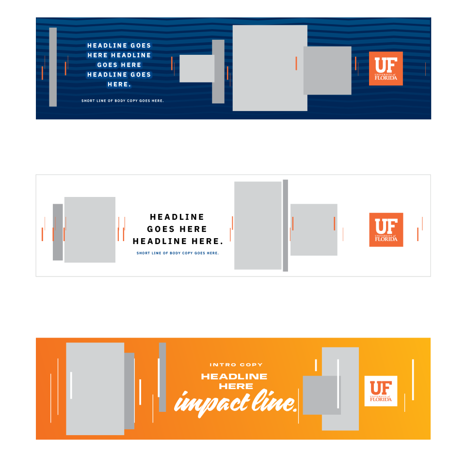
Sample Layouts
We’ve created a library of generic templates to make the design process faster. This library is not exhaustive and should continue to grow as more pieces are created. These layouts are good starting points, but each will require adjustments based on the piece’s unique content and size.
Usage Guidelines
Here are a few practices to follow to ensure that our work is consistent and recognizable.
NOTE: Accessibility is an essential factor when designing using momentum lines. Typography should never be placed on top of momentum lines without guaranteed legibility.
Best Practices
|
Use a color-filled box behind any type, ensuring no letters fall directly on the grid. | 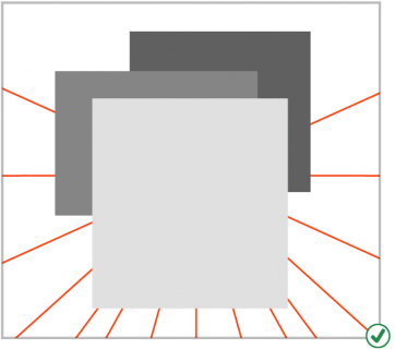
|
|

Unapproved Use
| 
|
|
|
|
|
|
|
|
|
|
|
|
Timelines
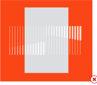
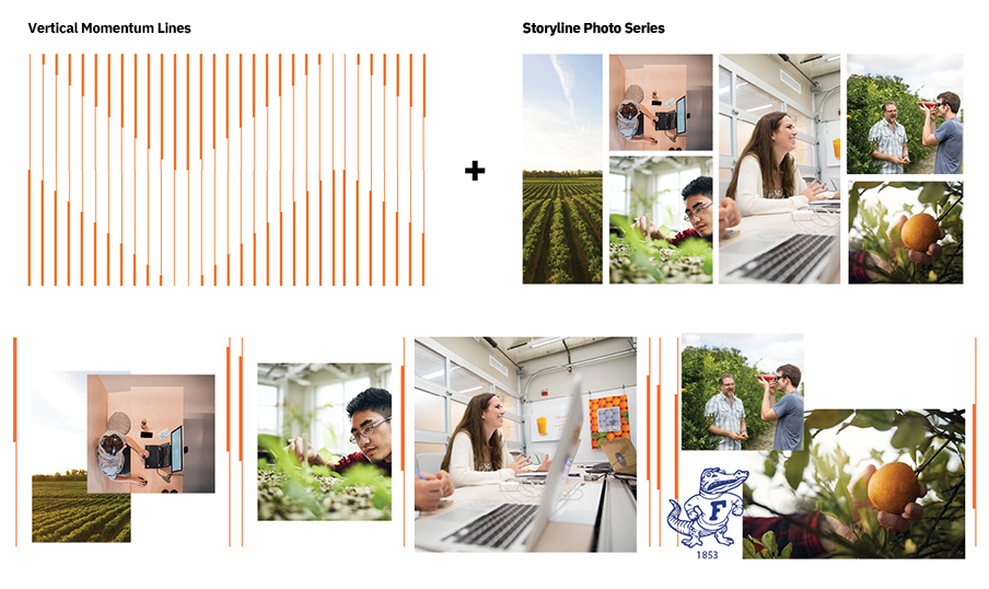
Timelines use a series of photos to tell a story of momentum from start to finish. By varying the scale and width of the photos, these graphics depict continuity and progression. Timelines derive from our momentum lines and use repeating vertical lines in a horizontal direction. The distance between lines should not be equal — gaps between lines and photos represent the “behind-the-scenes” time spent working on the idea.
Tip: Many people and details contribute to a great idea. It’s essential to feature a variety of subjects in timeline photos. Be sure to show the faces of the Gators who worked through the idea and include detailed shots that further illustrate the subject. Varying photography styles aid in storytelling and make for a more compelling visual.
Sample Layouts
Best Practices
Creating a timeline is straightforward; achieve a similar result every time by following the steps below. It’s important to remember that the amount of photography and copy will dictate how simple or complex each timeline looks. We recommend that only experienced designers create new timelines.
| |
|
|
| |
| |
Unapproved Use
|
|
|
|
|
|
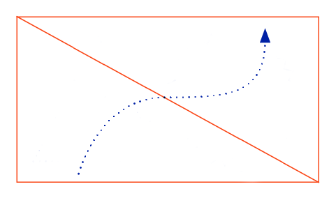
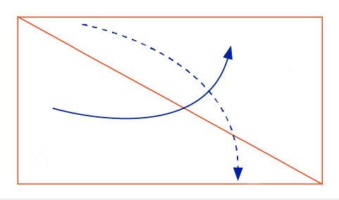
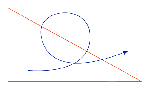
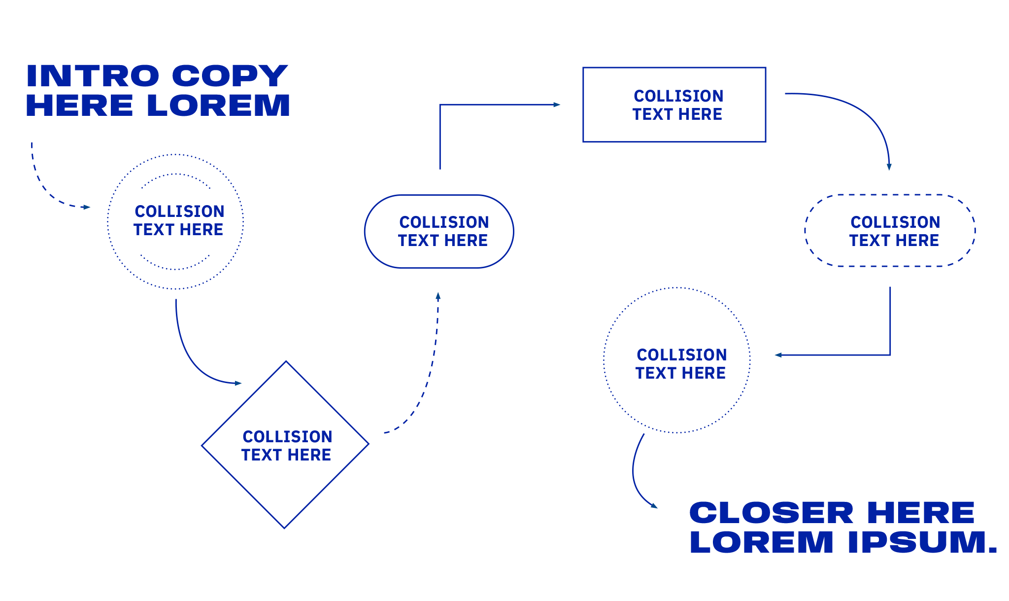
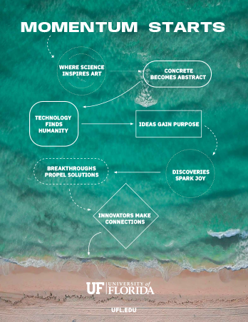
Kinetic Energy Maps
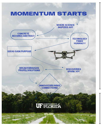
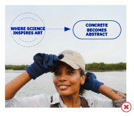
The University of Florida’s energy is kinetic. Here, ideas bounce off each other, unlikely pairings collide, and momentum shifts in unexpected ways, all in the pursuit of the greatest solutions. We can visually express this style of collaboration through kinetic energy maps. These designs move the reader from one point to another with arrows, shapes, and stories.
This graphic element is an excellent tool for telling stories of collaboration. The constant motion created by the shapes and arrows is eye-catching and works well on social media.
Keep these designs simple — too many ideas in one layout can feel frenetic. The intention is to quickly get the reader from the entry point of copy to the closing copy while offering them a fun ride of copy mashups along the way.
Tip: Think of these layouts like fast-paced instructions. The reader needs to be able to quickly and easily move from start to finish.
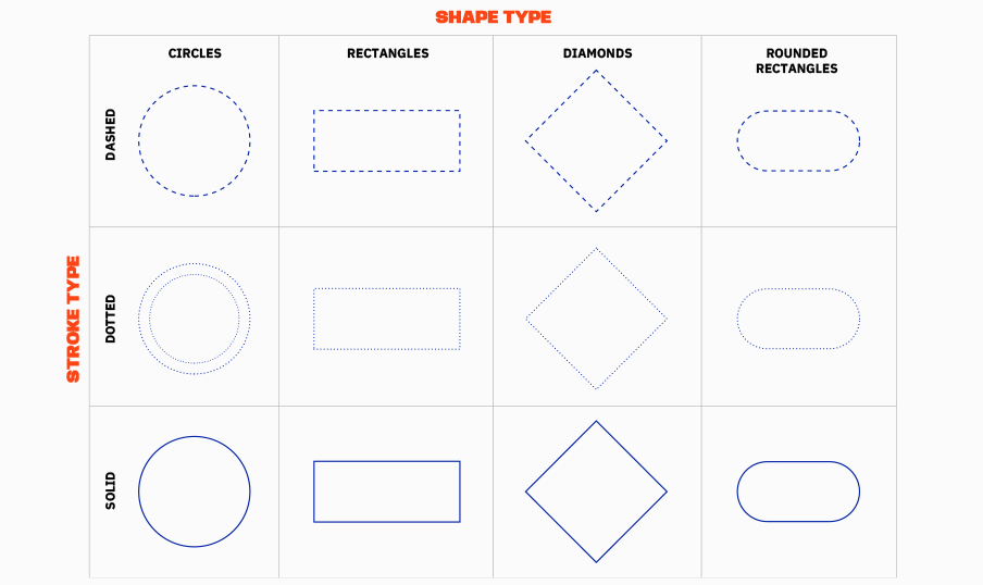
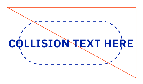
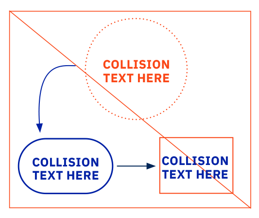
Geometric Elements
The table below shows the standardized stroke and shape types that should always be used.
The stroke type should always be solid, dotted, or dashed as shown in the examples below. The shape type should always be a circle, rectangle, diamond, or rounded rectangle. The weight of these elements is variable, depending on the size and scale of the piece.
Arrows
Lines and arrows are a great way to guide navigation within a kinetic energy map or to emphasize a word or phrase. They also convey process and place, reinforcing the concept of one idea leading to the next.
While lines seem like elementary graphic devices, applying them thoughtfully can elevate a design. An easy way to do this is to establish a standard weight for lines and arrows throughout an entire piece of collateral. Another is to ensure the weights consistently relate to another design element in the layout, like the weight of the text.
Note: For standard print pieces (around 8.5 by 11 inches), the rule weight should generally be 2 or 3 points and not exceed 5 points. This rule of thumb can be scaled up proportionally for larger pieces.
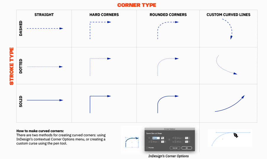
Photo Backgrounds
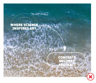
When creating a kinetic energy map, a background flood of orange or blue is often the preferred design solution. When designing a kinetic energy map with a background photo, use a single image representing the piece’s broader concept. The image must be simple, with about 2/3 of the image offering negative space. Avoid photos with distracting details within the negative space to achieve optimal legibility. The remaining 1/3 of the photo should be contextual, offering a sense of place or concept without being overly descriptive. Do not feature faces in these background photos.
Best Practices
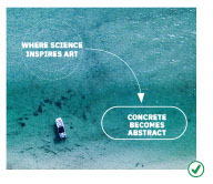 Select photos with lots of negative space and even colors and contrast. | 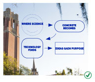 Use objects within the photo to frame the path of the map. |
 | Top 2/3: Negative space Bottom 1/3: Contextual space |
Unapproved Use
| 
|
|
|
|
|
| 
|