uNIVERSITY OF FLORIDA Colors
Beyond our logo, color is the most recognizable aspect of our brand. Our color palette helps audiences identify us at a glance. The way we use color sets the mood for each piece and reflects our heritage and surroundings. Our communications draw on three color palettes to unite them.
Note: Many of these colors should look familiar because most of them, including the primary orange and blue, have not changed. Several colors in the secondary and accent palettes have changed, so even if they look similar to those you’ve used in the past, use this guide to ensure that you are using the correct colors.
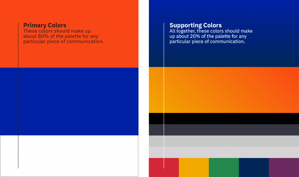
Color Ratios
Our color palette is bold and distinctive. It relies primarily on our traditional colors of orange and blue – and generous white space. Secondary colors are used for deeper content levels in layouts.
Note: Always use the color values listed in this section when using color builds. They have been adjusted for the best screen and print reproduction and may not match Pantone Color Bridge breakdowns.
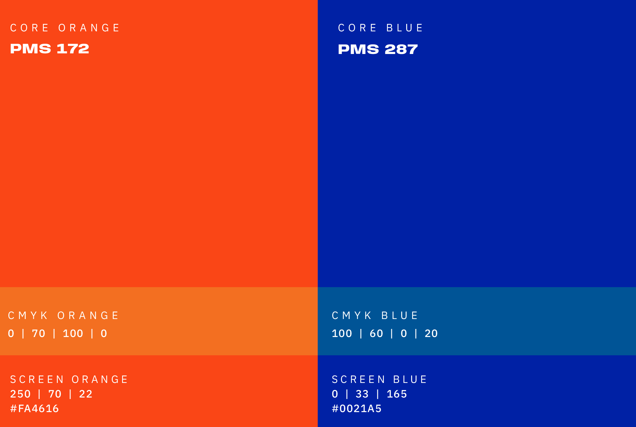
UF Colors
At our core, we are orange and blue.
With that in mind, this palette unifies the brand’s colors, reflecting our institution’s philosophy and mission.
Note: Always use the color values listed in this section when using color builds. They have been adjusted for the best screen and print reproduction and may not match Pantone Color Bridge breakdowns.
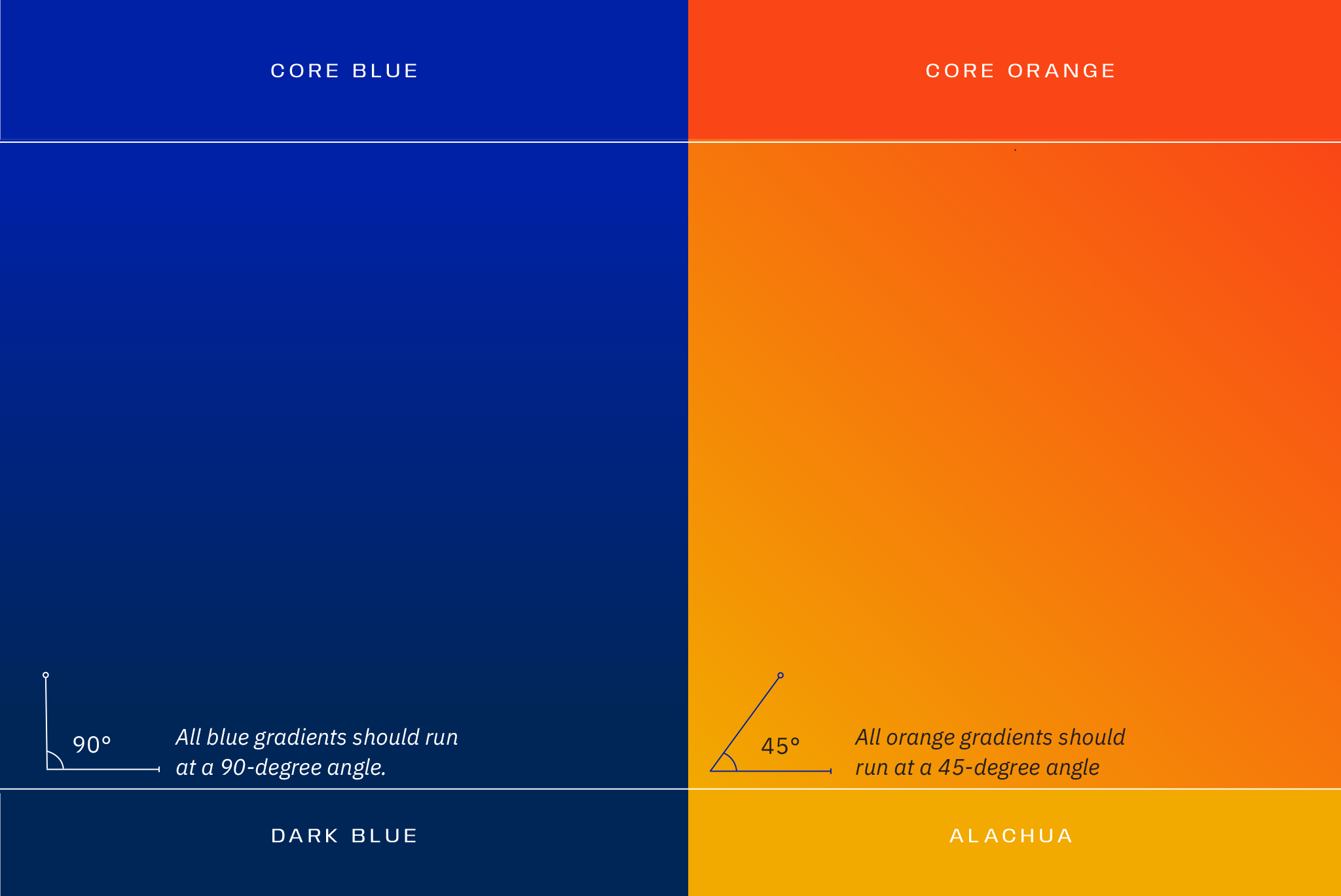
Gradients
Two color gradients are available for use. They pair our Core Blue with Dark Blue and our Core Orange with Alachua.
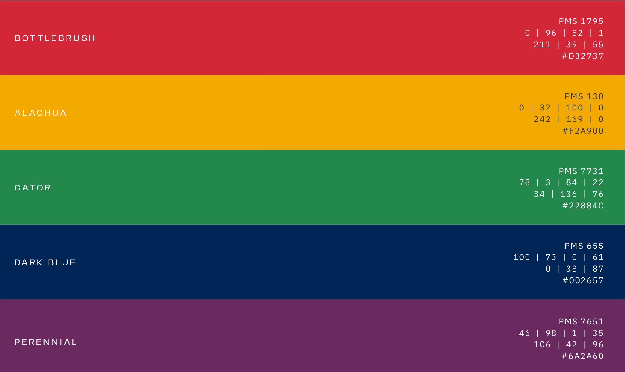
Secondary Palette
Orange and blue should drive most marketing, campus, and alumni materials, but sometimes other colors are needed.
Secondary palette colors are best suited for internal communications, but they may also be used in long-form communications where more colors are needed for variety, infographics, and icons. Large fields of these colors should be avoided. Be sure that our primary orange and blue are always the most prominent colors.
Under no circumstances should any of these colors become the predominant color for a school, center, institute, or department.
Neutral Palette
Neutral tones can add depth, warmth, sophistication, and richness to our communications. Note, however, that white should be used more frequently and prominently than these neutrals.
Note: White is an indispensable color. Rather than viewing it as a blank area, see it as a break. Please don’t rush to fill it: it can focus attention on what is there rather than drawing attention to what isn’t. Always balance color, typography, and graphic elements with open space.
Note: We only use black for long passages of body copy. Never use it in any other way.
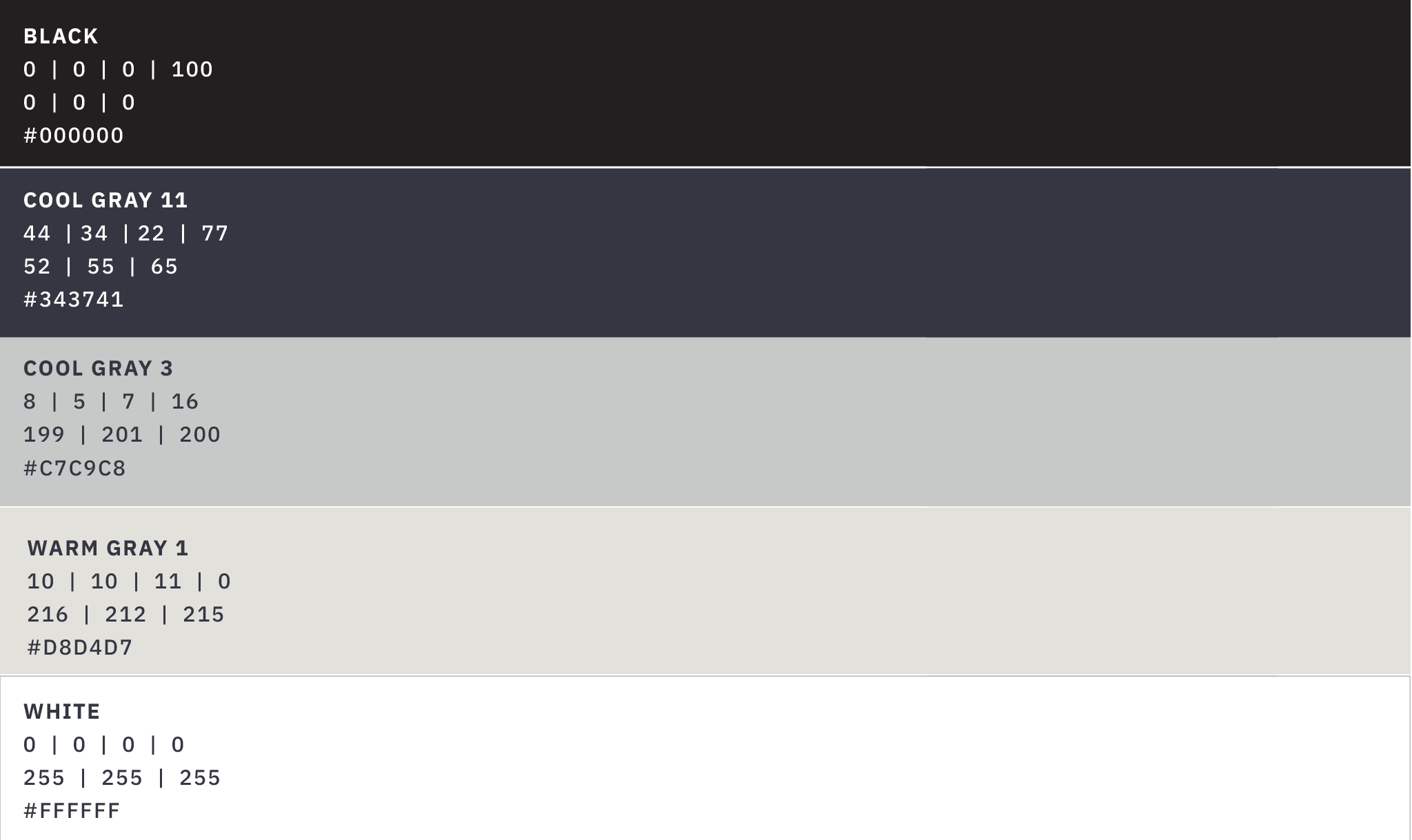
Color Numbers
| COLOR | COLOR NAME | PMS | CMYK | RGB | HEX |
|---|---|---|---|---|---|
 | CORE ORANGE | PMS 172 | 0 | 70 | 100 | 0 | 250 | 70 | 22 | #FA4616 |
 | CORE BLUE | PMS 287 | 100 | 60 | 0 | 20 | 0 | 33 | 165 | #0021A5 |
 | BOTTLEBRUSH | PMS 1795 | 0 | 96 | 82 | 1 | 211 | 39 | 55 | #D32737 |
 | ALACHUA | PMS 130 | 0 | 32 | 100 | 0 | 242 | 169 | 0 | #F2A900 |
 | GATOR | PMS 7731 | 78 | 3 | 84 | 22 | 34 | 136 | 72 | #22884C |
 | DARK BLUE | PMS 655 | 100 | 73 | 0 | 61 | 0 | 38 | 87 | #002657 |
 | PERENNIAL | PMS 7651 | 46 | 98 | 1 | 35 | 106 | 42 | 96 | #6A2A60 |
 | BLACK | PMS BLACK | 0 | 0 | 0 | 100 | 0 | 0 | 0 | #000000 |
 | COOL GREY 11 | COOL GRAY 11 | 44 | 34 | 22 | 77 | 52 | 55 | 65 | #343741 |
 | COOL GREY 3 | COOL GRAY 3 | 8 | 5 | 7 | 16 | 199 | 201 | 200 | #C7C9C8 |
 | WARM GREY 1 | WARM GREY 1 | 10 | 10 | 11 | 0 | 216 | 212 | 215 | #D8D4D7 |
 | WHITE | WHITE | 0 | 0 | 0 | 0 | 255 | 255 | 255 | #FFFFFF |
Digital Palette
Like printed colors, screen-based colors should be consistent across multiple pages and sites, and a limited color palette is well-suited for digital applications.
All communications should follow the brand’s core color palette. The hexadecimal values of our core palette have been optimized for accessibility on light and dark backgrounds, which can be found above.
To learn more about using the UF Brand Colors with dark mode, download the following presentation: Designing for Dark Mode.
For additional information, contact us using the form at the bottom of this page.
Color Consistency:
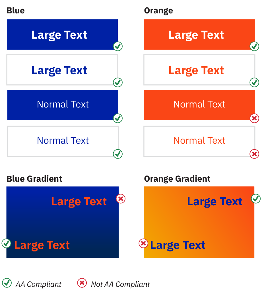
Use hexadecimal values to ensure that colors are consistent across print and screen applications. Hexadecimal values of our colors are adjusted for AA Normal Text Compliance (tested on webaim.org color contrast checker).
AA-Compliant Color Formulas for Screen Applications
Ensuring adequate text and visual media contrast can help people with visual impairments navigate content more easily.
The Web Content Accessibility Guidelines (WCAG) provide a set of international standards developed by the Worldwide Web Consortium (W3C), the web’s governing body.
AA Level compliance is a vital contrast standard for displaying text and images in both the foreground and the background. The goal of this accommodation is to help ensure that our online content is equally accessible and user-friendly to all users.
Because of their quick impact and smaller size, communication pieces on the web (such as web ads) should only feature our orange and blue colors. In the examples here, we’ve outlined a short list of compliant and non-compliant color pairings for our core colors.
This list is not comprehensive; it’s essential to check accessibility for every piece you create. For additional guidance on web accessibility, visit WebAim’s contrast checker.
Note: Large text is typically defined as 14 points or larger and bold.