
Typography
Typography is a vehicle for our brand voice, contributing to how our messages are read and communicated. When used thoughtfully, typography becomes a powerful brand tool that adds visual depth to our words. Our typographic style is clear and clean, with enough flexibility for various situations.
Font Families
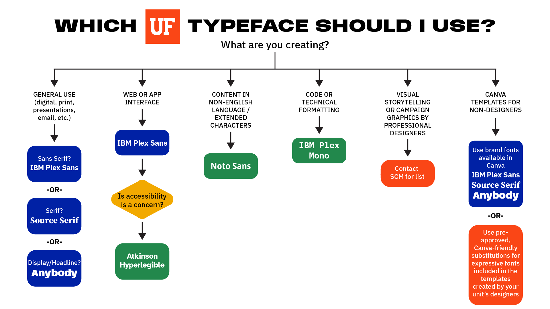
Our communications use different typefaces that work together to bring our story to life. Together, these typefaces create a clear hierarchy and keep our content legible and engaging. Each has strengths, so use the following section to guide your typographic choices.
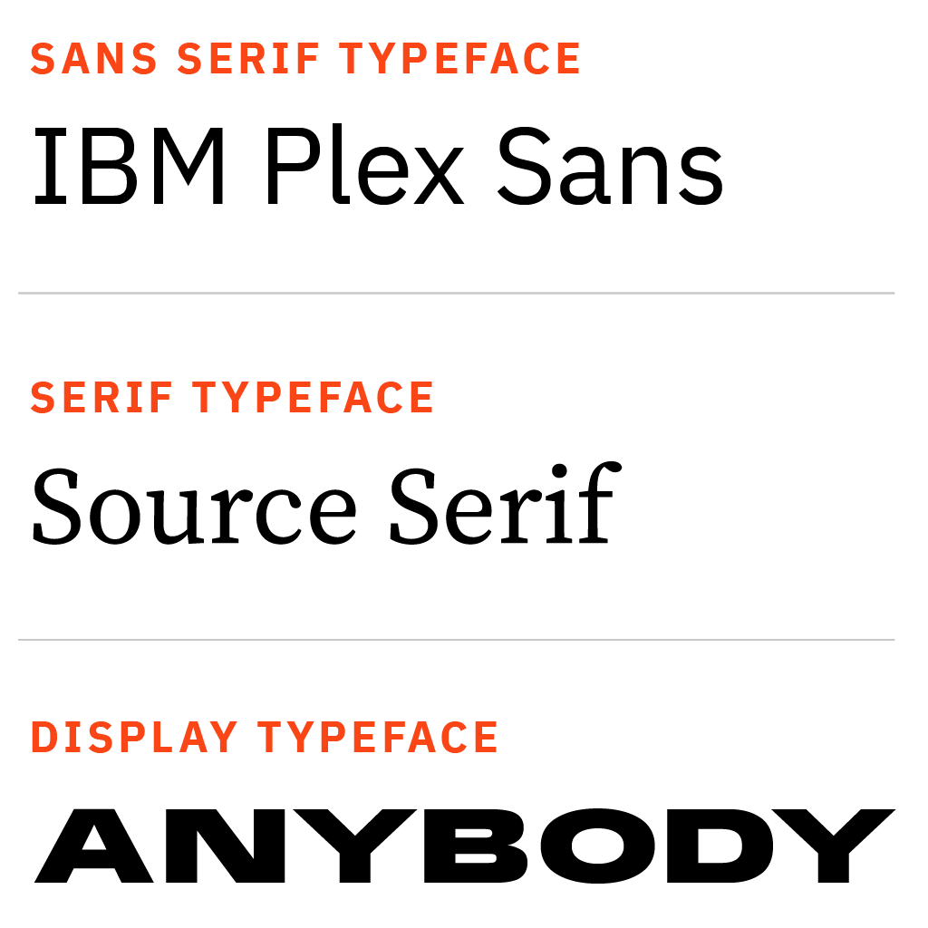
IBM Plex Sans
IBM Plex Sans is the primary workhorse for our communications. It is a clean, friendly typeface that can be used for virtually any typographic application. IBM Plex Sans pairs well with our more expressive accent typeface.
Source Serif
Source Serif is our serif typeface. We use it for pieces that require a more classic, academic feeling. It works well for longs runs of text, callouts, and other supporting copy.
Anybody
Anybody is our display typeface. It performs well in headlines and pairs well with IBM Plex Sans and Source Serif. It is appropriate for brief callouts, factoids, and numbers. It is also suitable for adding emphasis.
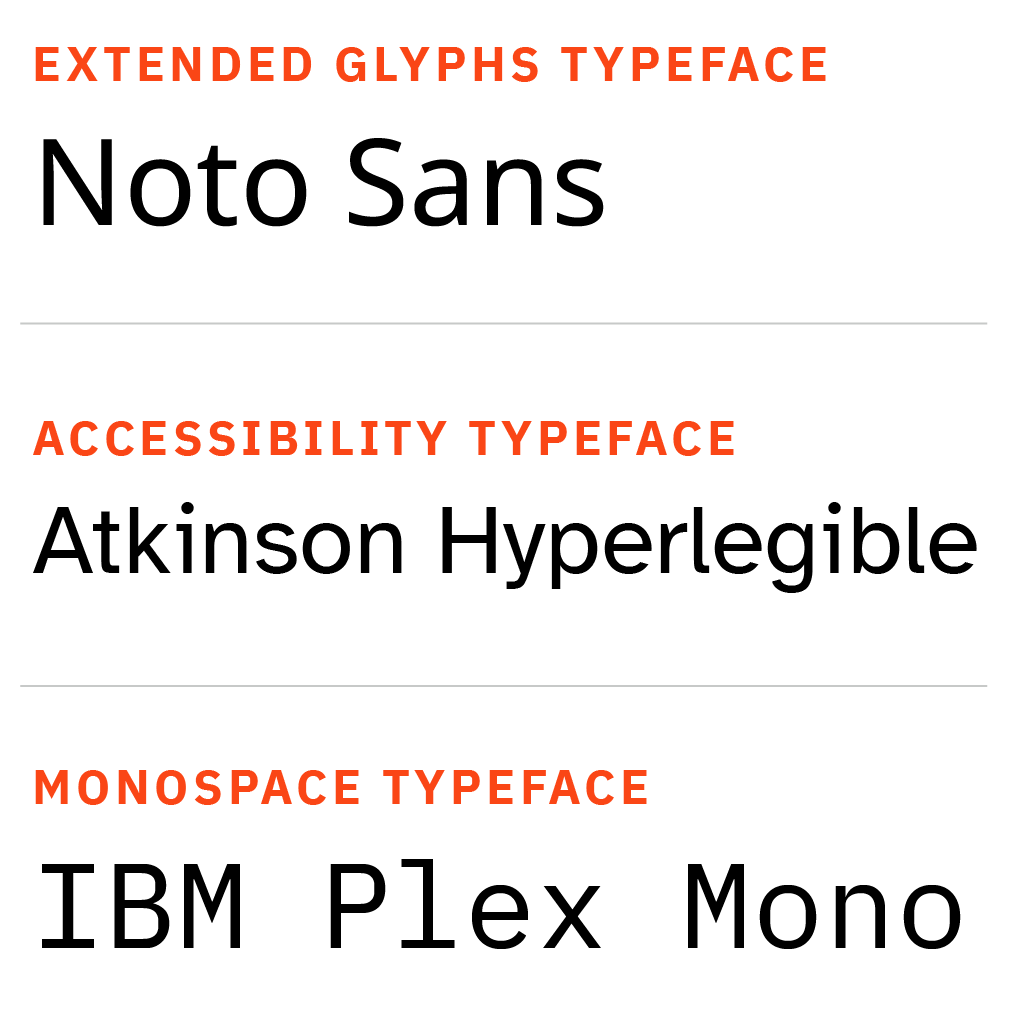
Extended Character Language Support and Accessibility
Noto Sans works both headline and body copy when communicating in languages for which the necessary glyphs are not available in other brand fonts. Constantly updated, Noto is an open-source font designed for communication in “all ancient and modern languages.”
Atkinson Hyperlegible Next is an award-winning font family designed specifically to increase legibility for readers with low vision and to improve reading comprehension. This sans-serif emphasizes distinctive characters over uniformity allowing for better recognition and reading comfort.
IBM Plex Mono pairs well with any of the typefaces recommended in this document. It can be used to differentiate AI-related materials and in places where a monospaced typeface is necessary (like in coding, technical documentation, or tables).
Expressive Display Typefaces
While the brand’s serif and sans-serif fonts establish consistency and professionalism, an extended range of expressive display typefaces allows for creative flexibility in headlines and more expression within the brand. Our expressive font collection was selected to provide campus design professionals with additional tools to elevate their work.
Non-designers should use only the core brand fonts, as they are easier to use while maintaining a polished, on-brand look. A list of pre-approved expressive typefaces is available to design professionals. Please email brand-center@ufl.edu for the list.
Additional Font Options
Any typefaces not on the pre-approved list must be submitted to SCM for approval to ensure they align with the brand’s tone, legibility, and overall guidelines (email proposed layout to brand-center@ufl.edu for review). Approval is not guaranteed and will be made on a case-by-case basis. Alternative display typefaces must strictly follow these guidelines:
- Brand Alignment: The typeface should complement the brand by maintaining a tone consistent with UF’s academic and professional image. Fonts will only be approved if they feel confident, modern, and sophisticated.
- Legibility & Readability: Display typefaces should be clear and impactful at various sizes. No fonts will be approved if they have excessive flourishes, extreme letterforms, poor spacing or are handwritten in ways that could hinder readability.
- Tone Consistency: The typeface should enhance the message without distracting from it. No fonts will be approved if they are overly playful, retro, grunge, distorted, illegible, graffiti, horror-themed, or novelty-driven styles.
- Pairing with Core Fonts: The expressive typeface should work harmoniously with the brand’s serif and sans-serif fonts. No fonts will be approved if they have clashing aesthetics or mismatched weights.
- Display Only: Expressive typefaces should only be used for display text. They should never substitute for the brand’s serif and sans-serif fonts.
- Licensing: Units are responsible for securing appropriate font licensing.
When in doubt, designers should consider whether the typeface enhances the message or distracts from it.
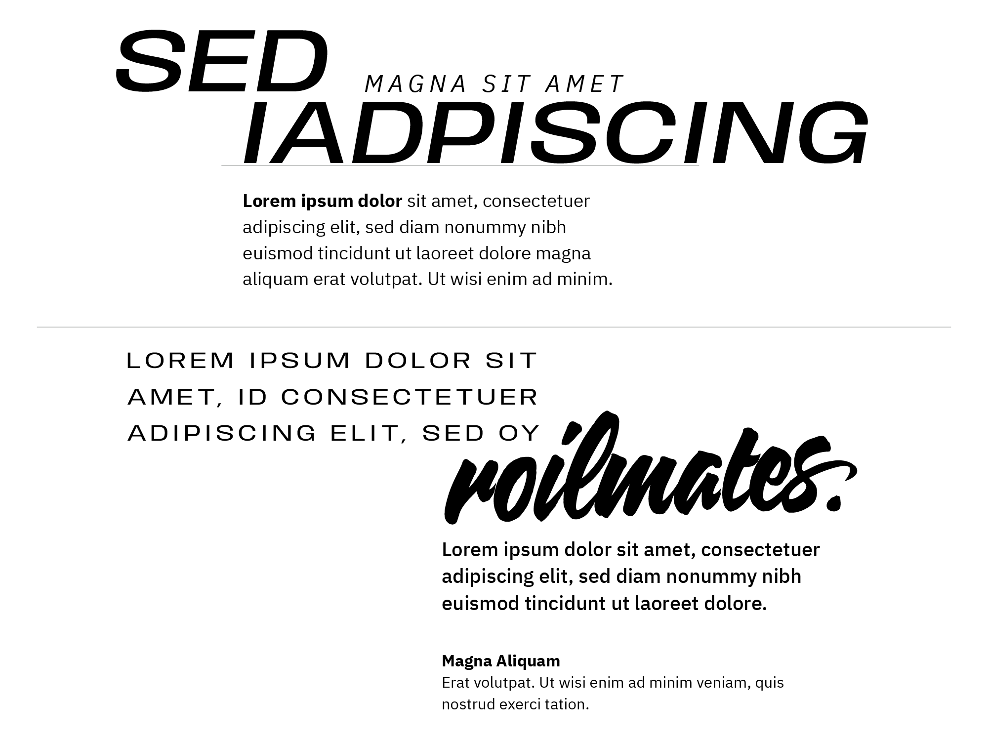
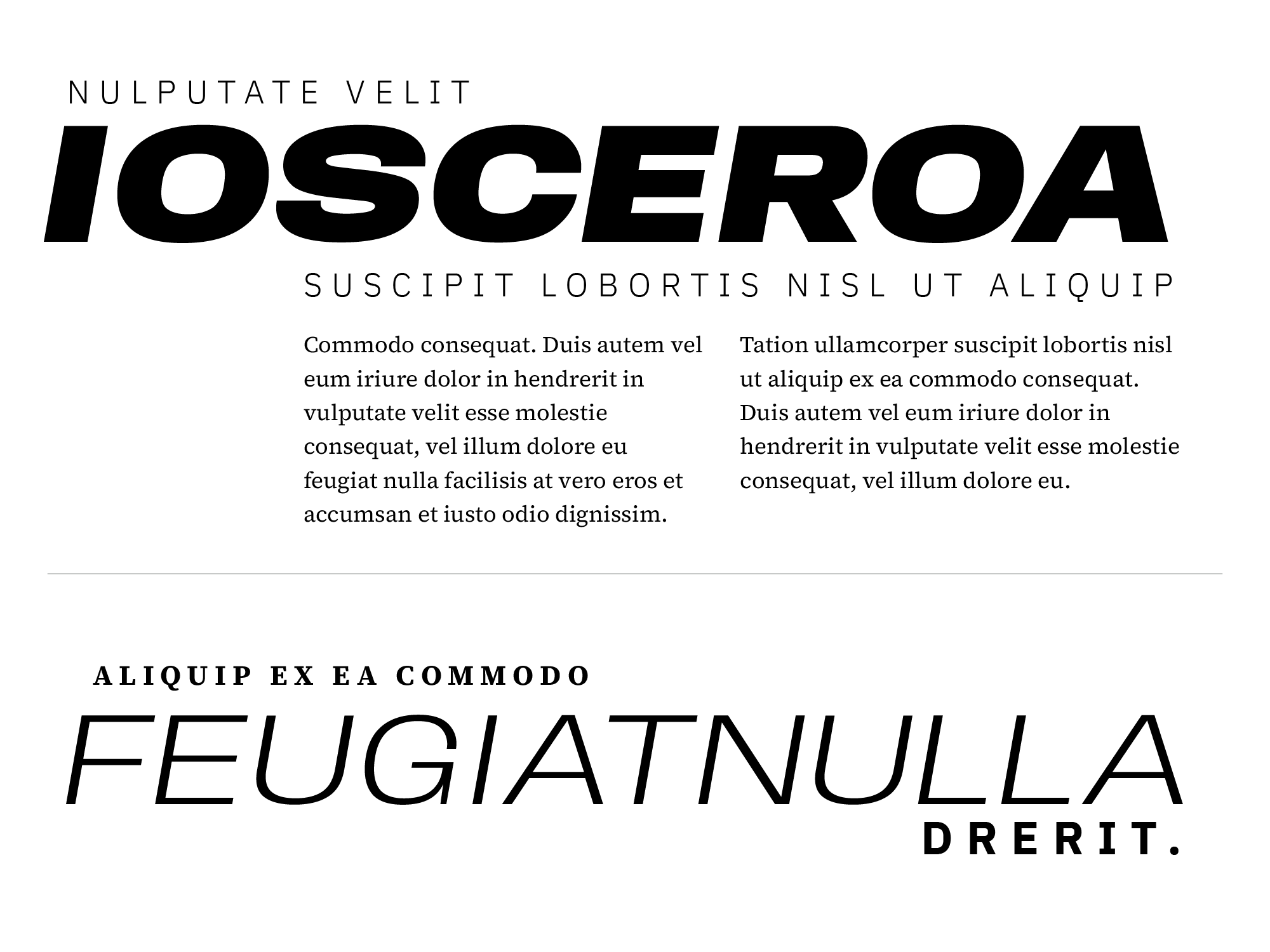
Typesetting Examples
These examples show type combinations that show the range of expression our typography can achieve.
Download Fonts
All University of Florida core brand fonts are open source and can be downloaded from Google Fonts.
FAQ
If you have font questions that are not addressed below, please email brand-center@ufl.edu.
No. The move to open-source typefaces/fonts does not reflect a holistic change in the current brand platform. These typefaces are very similar to the existing brand platform typefaces, but they are free and will be easier to use and implement due to their more universal availability. (For example, when using non-UF computers to share PowerPoint presentations, there will be no need to use alternatives to the brand fonts or save presentations as PDFs.)
Since the implementation of the current brand platform, the range of open-source typefaces/fonts has significantly increased.
In addition, unlicensed fonts are easier to manage and more cost-effective. The update was initiated, in part, due to contact from Monotype, a group that handles font licensing for select designers and foundries. Monotype made a claim for unlicensed font usage, which has been negotiated and settled.
An ad hoc committee of design professionals from across the university recommended the fonts. They were guided by principles including:
- Compatibility with current brand platform.
- Flexibility (Range of glyphs, etc.).
- Distinctiveness (the committee avoided fonts core to aspirational and peer institutions).
- History of the typeface – how and when it was developed and the way it has been used.
- To meet the terms of the Monotype settlement, the use of the licensed fonts that have been a part of the University of Florida brand platform must cease by June 27, 2025.
- The online brand guidelines and downloadable materials, including templates, will reflect these changes.
- UFIT has been a part of the planning and will update web templates accordingly.
- Units not supported by Web Services will be responsible for implementing the changes.
- Print materials (including signage) using the current brand fonts that have already been produced will not need to be discarded or replaced.
- Existing electronic materials, including websites, must be updated by June 27, 2025.
- All materials produced after June 27, 2025, must adhere to the new brand standards and fonts.